What's new
SWG Beyond

Register a free account today to become a member! Once signed in, you'll be able to participate on this site by adding your own topics and posts, as well as connect with other members through your own private inbox!

Community Feedback: NGE User Interface (UI) vs. Pre-CU User Interface (UI)

Which of the two user interfaces shown below should be the Beyond default?

  • NGE User Interface

    Votes: 15 46.9%
  • Pre-CU User Interface

    Votes: 17 53.1%

  • Total voters
    32

CSRDaryn

Staff
Staff member
Greetings Beyonders,

In an attempt to simplify current and future game updates/QoL's, we would like to select a Beyond default User Interface (UI).
We are asking the community for some feedback on which is preferred by the majority.

Please take a moment and cast your vote. Thank you in advance for your support!

NGE:
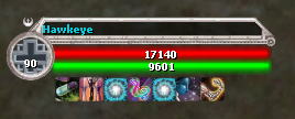
image4.png
image3.png

Pre-CU:
image.png
image2.png
 
Last edited:

Van

New member
I also voted Pre-CU, but also think a toggle option would be best so people could just use the one they like best.
 

Xcon

Active member
The Pre-CU is much cleaner. Hope you can add the numbers on the health and stam bars like the NGE UI.
 
  • Like
Reactions: Van

Adorkdarkfly

Active member
If precu is the winner please do not let the name plates with the health/action bars take up half the screen, unless there is a resize option. Keeping them the same size as the NGE option will make it an easier transition imo.
 

DarthCannabis

New member
Currently using a mod that does exactly this (for the health and action bars at least)... Would be great to see it as an option at least so I can uninstall the mod lol

1708419425947.png
Wouldn't be able to heal without it lol
 

Drakkun

Member
I wouldn't mind having the option to choose. However biggest thing I've ever hoped for is just resizable UI elements and in game options for increasing font sizes, regardless of the ui style choice. More color choices even. I will always side with which ever is the closest to dark mode lol.
 
Top